Exploration of the dataset
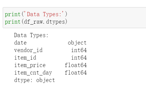
This article shows the modeling process for a sales/revenue dataset. The dataset contains 2,935,846 records of sales data from Jan 01, 2013 to Oct 31, 2015 with 60 vendors and 22170 items. Brief description of the dataset is shown below.
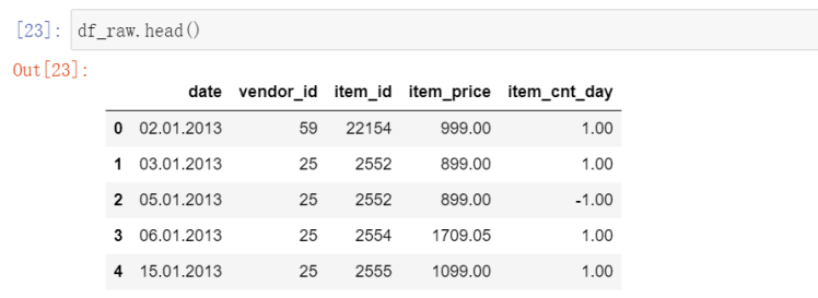
To make this dataset easier to work with, I will re-format the date to Pandas Datetime and convert vendor_id, item_id into strings. Date is not suitable to be set as index because there will be duplicated values.
After converting the data, I will split the dataset into two, one for sales data and another one for returns data. This step is for business analysis purpose as the company might want to know which vendor/item has the best sales and the most returns. The split will be based on the sign of item_cnt_day. A positive sign means sales and a negative sign implies returns. I created a function for plotting pie charts and the results are:
df_sales = df_raw[df_raw['item_cnt_day'] >= 0]
df_returns = df_raw[df_raw['item_cnt_day'] < 0]

def plot_top_n(data = df_sales, group_by = 'item_id',plot_col = 'total_sold', top_n=15):

    data = data.groupby(by=group_by).sum()[[plot_col]]
    title = 'The TOP {} {} {}'.format(top_n, 'SELLING' if data['total_sold'][0]>0 else 'RETURNS', 'Products' if group_by=='item_id' else 'Vendors')
    if data['total_sold'][0]<0:
        data = data.mul(-1)

    data.sort_values(by='total_sold', ascending=False, inplace=True)
    top_data = data[:top_n]


    plt.figure(figsize=(8,8))
    plt.pie(top_data['total_sold'], autopct="%.1f%%", labels=top_data.index.values)
    plt.title(title)
    plt.show()
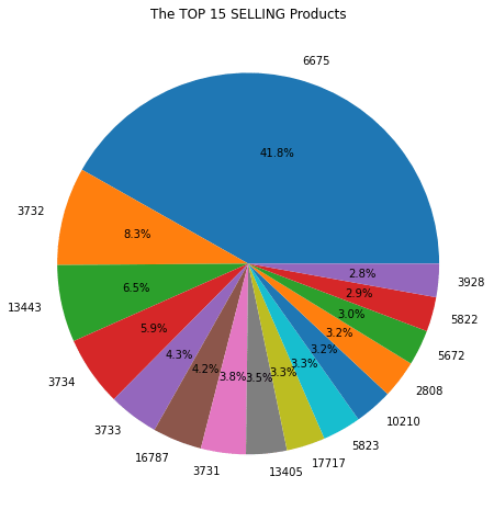
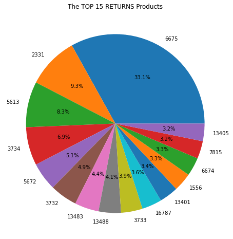
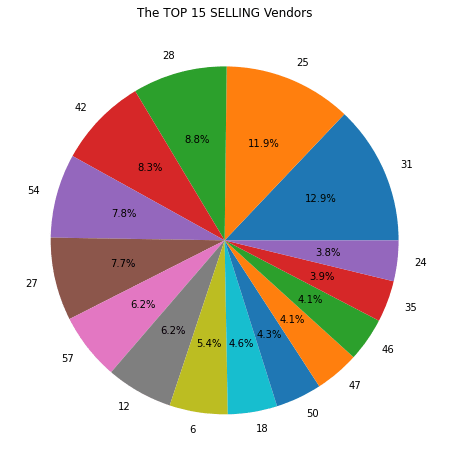
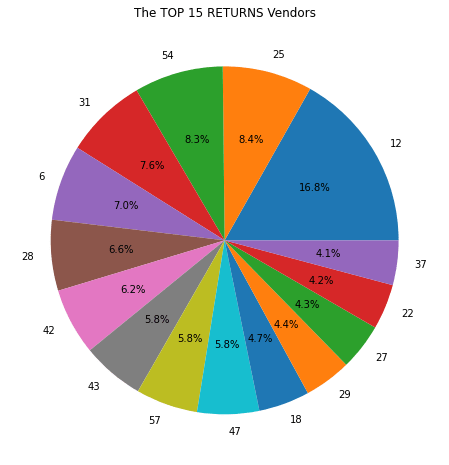
There is more to be explored but let’s draw some conclusions here:
- Item 6675 contributes 41.8% of total sales and 33.1% of total returns, meaning the item is most likely of above-average quality and has large demand.
- Vendor 31 contributes 12.9% of sales and only 7.6% of returns.
- 6.2% of sales are from vendor 12 as well as 16.8% of returns, which indicates items sold by vendor 12 have higher-than-average returns.
More questions can be answered, such as “which month has highest sales?” and “which product has the highest sales in that month?”. But for now, let’s dive into the statistical EDA of this dataset and prepare the dataset for modeling.
Preparation for modeling
For a time series data, we need information from two perspectives to determine the techniques to be used for modeling:
- Trend/Stationarity Test (including white noise test)
- Seasonality Test
First, let’s plot a line graph showing daily revenue and a histogram showing the distribution of revenues.
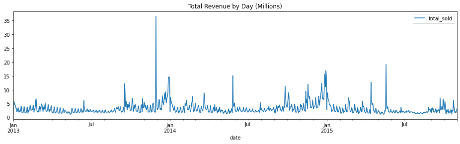
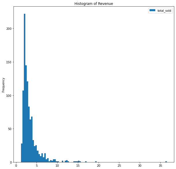
By observing the graph, we do not see any trend and the dataset seems to be stationary. Let’s double confirm the conclusion by Augmented Dickey Fuller Test.
from statsmodels.tsa.stattools import adfuller

df_daily = df_raw[["date", "total_sold"]].groupby(by="date").sum().resample('D').sum()
p_val=adfuller(x=df_daily['total_sold'])[1]

print('Augmented Dickey-Fuller Test has a P-value of {}, indicating the data is{} stationary.'.format(p_val, ' not' if p_val>0.05 else ""))

Now, let’s inspect seasonality of the data. First, we separate the data of year 2013 from 2014 and try to identify seasonality for 2013 and 2014 individually. The technique I will be using is periodogram and it generates graphs as follows:
from scipy.signal import lombscargle

y1 = df_daily.loc['2013-01-01':"2013-12-31"]
y2 = df_daily.loc['2014-01-01':"2014-12-31"]
x = y1.index - y1.index[0]
x = x.days.values

ang_freq = np.linspace(1, 365, 365)
pg1 = lombscargle(x, y1['total_sold'], ang_freq)
pg2 = lombscargle(x, y2['total_sold'], ang_freq)


fig, ax = plt.subplots(nrows=2,figsize=(16,8), sharex=True)
ax[0].plot(ang_freq, pg1)
ax[0].set_title("LombScargle Periodogram for Year 2013")
ax[1].plot(ang_freq, pg2)
ax[1].set_title("LombScargle Periodogram for Year 2014")
plt.xlabel("Frequence")

plt.show()
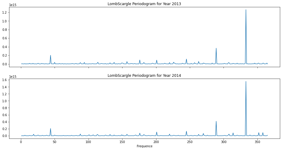
The patterns in periodogram are similar for 2013 and 2014 and we do not observe any spikes at expected frequencies (7, 30, 90, etc.). The major spike at close to 340 does not imply any seasonality.
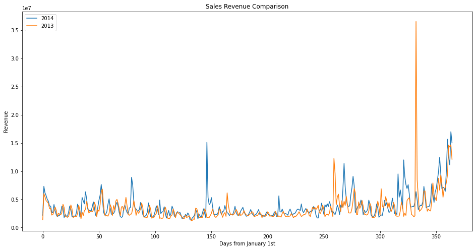
To conclude, the sales data in 2013 and 2014 are stationary and do not show any seasonality. As for now, it seems ARIMA, or ARMA more precisely, is a good fit for this problem. But, before actually modelling, I would like to compare the data in 2013 and 2014 and perform some visual inspection.
f, ax = plt.subplots(nrows=1, figsize=(16,8))
ax.plot(np.arange(0, 365,1),y2.resample('D').sum(), label='2014')
ax.plot(np.arange(0, 365,1),y1.resample('D').sum(), label='2013')
plt.legend(loc='upper left')
plt.show()

2 thoughts on “Modeling Revenue Data – Part I: EDA”